

In urban areas such as Atlanta, food deserts are defined as census tracts where a significant part of the population is a mile or more from the nearest supermarket, as these are assumed to provide the best and most affordable access to healthy foods. A number of policy solutions have been proposed to address the potentially negative health impacts for those living in food deserts, most notably the federally funded Healthy Food Financing Initiative. This program, as well as others like it at the state or municipal levels, support the creation of new food outlets through tax incentives or grant funding. In Georgia, for example, one loan funded the creation of a neighborhood grocery in College Park.1
But the results from these efforts have been mixed. Some researchers have found that new supermarkets have only a modest effect on residents’ dietary behaviors,2 and others have questioned whether direct income supports for low-income individuals wouldn’t ultimately be a more effective policy solution than tax credits for developers.3
Rather than using the ecological metaphor of food deserts, some scholars have used the term supermarket redlining.4 Redlining refers to discriminatory practices in the housing industry dating to the 1930s. During this time, the Home Owners’ Loan Corporation (HOLC) created maps of many major urban centers that showed the lending risk in specific neighborhoods. Areas with an “A” grade were excellent candidates for home loans. At the other end of the scale, areas with a “D” grade – usually marked in red – were considered poor risks.
“Redlined” areas were often determined based on a high rate of African American residents. In a previous post in Atlanta Studies, Jason Rhodes provided a fuller explanation of how HOLC maps impacted Atlanta specifically,5 and the University of Richmond also has an excellent resource for viewing HOLC maps in most major urban areas.6 These maps, and the logic that undergirded them, had a significant effect on mortgage lending throughout the twentieth century, and even to the present day.7 As a result, African Americans were systematically denied home mortgages during the largest housing boom in the nation’s history. Combined with other practices such as housing covenants, restrictive zoning, and urban renewal, redlining contributed to the flight of affluent, white homeowners to booming suburban communities.
Supermarket redlining as a term, then, resists framing disparities in access to healthy foods as just a side effect of an otherwise functional market or some “natural” urban ecology, as a bug in the system so to speak. Rather it highlights how the locational decisions of food retailers are evidence of intentional disinvestment in low-income neighborhoods and communities of color. This parallel is not simply metaphorical. Historically, supermarkets grew up along with the suburbs, relying on the sprawling, car dependent landscape of these low density communities.8 Supermarkets were created with suburban residents in mind, and so the forces that created the suburbs also shaped our food shopping options.
This legacy of the HOLC maps is clear if we compare the map for Atlanta, created in 1938, with the locations of food retailers in 2017. These data include only retailers that accept SNAP/food stamps, but this includes nearly all supermarkets in the Atlanta area. The map below shows multiple redlined neighborhoods, but the largest are south and west of downtown – the grey hatched area in the middle of the map. The large yellow dots on this map are stores classified as superstores or supercenters by the US Department of Agriculture, including Kroger, Walmart, and Publix. The smaller orange dots are stores classified as convenience stores by USDA. The connection between past redlining and current supermarkets is clear, as the latter are concentrated on the upper right side of the map. Conversely, convenience stores have the opposite pattern – most are located in the lower left, in and around previously redlined communities. The underlying data for this map are available here.
In a recently published article, my collaborators and I looked at changes in this retail landscape in the years immediately following the Great Recession in Atlanta. Our article focused specifically on major chains. Often, food retailers are summarized as making up the food environment, implying that these stores are simply a passive and impersonal backdrop for consumers’ shopping behaviors. Focusing on major chains, we wanted to highlight the active ways that retailers invest and disinvest in neighborhoods over time, responding to both changing demographics and shifting government funding. Specifically, we were interested in how these retailers reacted to increases in SNAP benefit distribution during the recession. The full article looks at twenty chains, but the locations of eight of those are summarized in the figure below, with county boundaries also included.
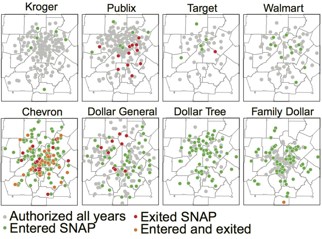
In these maps, grey dots show locations present during our entire study period, 2007 to 2013. Green dots became SNAP authorized retailers, red dots exited the program, and orange dots both entered and exited. Looking at the distribution of Publix and Target specifically, store locations were clearly clustered in the more affluent north side of the metropolitan area. Meanwhile, for Kroger and Walmart, this pattern is less stark. Most convenience stores followed a pattern similar to Chevron, concentrated to the south and east of downtown, with significant levels of turnover.
The variety among dollar stores was most intriguing, as Family Dollar was mostly located in and around the city of Atlanta, Dollar General was largely concentrated in moderate and lower income suburbs, and Dollar Tree was most concentrated in the affluent north suburbs. While commonly referred to collectively as dollar stores, these three retailers clearly use sharply contrasting strategies when deciding where to open new stores. While we lacked the resources to drill deeper, differences in the quality and variety of foods and other items between these chains may reflect – and even reinforce – a still deeply segregated urban landscape.
This analysis of Atlanta’s stores is part of a larger project examining changing participation in SNAP by retailers in the years following the Great Recession. Full data on SNAP retailers is available at the project website and repository, and an interactive dashboard where users can identify individual retailers and change over time in the 45 largest metro areas is available here.
Supermarket redlining ultimately highlights how food retailers have shaped investment around past policies promoting segregation as well as how their current locational strategies may continue to reinforce those divisions. Karen Washington’s recent use of the term “food apartheid” provides a similar and also compelling frame for racial disparities across the food system.9 Whatever terminology we use, research has found that in Atlanta and many other major cities, low-income communities consistently lack access to major food retailers offering affordable, healthy foods. But by reframing the ways we describe food access, we can highlight how current disparities are the products of a long history of social exclusion, that they are far from natural or easily contained to just a few targeted neighborhoods. The alternatives we develop must reckon with that system and rebuild its historically racist foundations.
